
There has been a lot of second guessing recently about the optimal timing for shutting down and reopening the “non-essential” components of our economy in order to minimize death from CoVid-19 without causing economic hardship disproportionate to the direct suffering from the pandemic that is avoided by these measures.
Mostly, we still (still!) have no idea who is and is not infected and infectious with this disease. Our testing was and is woefully inadequate, even pathetic, and everyone’s ducking for cover when this fact comes up because no one wants the blame for our utter lack of preparation for this inevitable outbreak laid on them.
If we knew, like a few countries have and do, precisely and promptly who was infected and infectious (through frequent and continuous universal testing, tracing, isolating and other things libertarians fear and loathe) then we could reopen everything immediately and just focus on the very few who are contagious (which is and has almost always been less than 1% of the population). In fact we wouldn’t have had to lock everything down in the first place, and we could have saved hundreds of thousands of lives. But we don’t know who is infectious. We have, mostly, no idea.
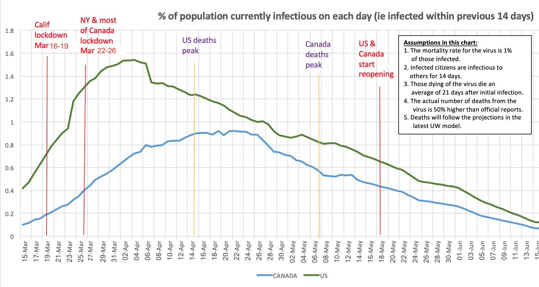
We can, however, start to make some educated guesses as to how many are infectious. It’s a very poor surrogate for who is infectious, when making lockdown and reopening decisions, but it’s better than the whims of politicians currently governing these decisions. I decided to come up with such an estimate, which is shown in the chart above.
Here are the very uncertain assumptions that underlie this chart:
- The mortality rate is somewhere in the area of 1.0% of those infected. This could change yet again (initially it was estimated to be 3%, then 0.2%, now 1% or a bit higher). It’s based on a growing series of serology (antibody) tests of broad populations, giving us a rough idea of how many have actually been infected, from which the mortality rate can be measured.
- Infected citizens are infectious to others for about 14 days. There’s a lot of uncertainty about this, but it still seems to be the consensus of the medical community.
- Those dying of the virus die on average 21 days after initial infection. Again, this seems a reasonable assumption, but there’s still great uncertainty about it.
- The actual number of deaths from the virus is 50% higher than the official reports in most developed countries with competent, open reporting systems. The “excess deaths” research to date suggests it could be considerably higher than this, and there’s endless debate about how many “excess deaths” were avoided by reduced travel and hazardous work and how many of the “excess deaths” were due to people being afraid or unable to go to hospitals, but these other factors may balance out, so the 1/3 under-reporting statistic seems reasonable.
- Future deaths will be close to those currently projected by the UW/IHME model. It’s been off in both directions, usually underestimating, but it’s the best we have to work with.
If any of these assumptions turns out to be significantly off, it will significantly affect the chart above, and I will make changes to it accordingly, at least for the next month or so (after which hopefully it will become useful only in hindsight).
So I started with the reported and UW/IHME forecast cumulative deaths on each day, and increased all these numbers by 50% (assumptions 4 and 5). Then I divided these by 1% (ie by 0.01) to estimate the number of infected-to-date as of 21 days earlier (assumptions 1 and 3). Then I computed the number currently infectious each day as the difference between the computed infected-to-date on that day, and on the date 14 days earlier (assumption 2). Those are the numbers plotted on the chart for Canada and the US above, shown as a percentage of the latest census numbers.
The daily number of deaths peaked much earlier in the US than in Canada, and was much more pronounced. That suggests that infections likely did likewise in the several weeks before the peak deaths.
One recent article suggested that politics, not hesitation, was behind the delay between California’s lockdown and New York’s. Another study, from Princeton, suggested that US deaths might have been halved if lockdowns had occurred even four days earlier, and reduced by 80% if they had occurred two weeks earlier. This would seem to jibe with the chart above — note the steep slope in the chart in the week between the California and New York/most-of-US/Canada shutdown dates. The likely number of infectious citizens doubled in both countries in that week.
What is notable about the chart above is that the current rate of decline in the number of infectious people has been much more gradual than the earlier rate of increase. This was seemingly part of the problem with earlier optimistic forecasts of an almost ‘normal’ curve of deaths. It also really shows the dangers of reopening so soon, especially when we still have no idea who is infected and who is infectious.
Of course, the percentages on this chart are just averages. In many areas, it is likely that no one within miles is infectious, while in others, especially in areas with vulnerable local populations, as many as 10% could be. We just don’t know. At any rate, it seems reasonable to suggest that in early April about 1.5% of all Americans were infectious (ie had been newly infected in the last 14 days), and, at the end of April, about 1% of all Canadians were likewise infectious. Can you imagine what would have happened without lockdowns and social distancing?
If this chart is at all accurate, reopening businesses, stadiums, and other high-density meeting-places, as is starting to happen all over the US and Canada, seems premature and perilous. But I guess we’ll see. If we see an uptick in daily deaths 3 weeks from now or so, we’ll know.


