Paul Krugman’s recent post indicates that perhaps those of us taking a stock-flow consistent approach to macroeconomics may be making some headway. My fellow blogger, Rob Parenteau, and another friend, Bill Mitchell both describe many of the details of this approach and how they fit the graph posted by Krugman. Rob is correct to suggest this would be a much better framework for understanding macroeconomics than the traditional IS-LM model, which was highly flawed to begin. My purpose here is to build on both of these posts and demonstrate a few uses of the model (thus, those not familiar with this framework should read Rob’s and/or Bill’s posts first, probably).
To begin, consider the graph in Krugman’s post below:
Figure 1: The Private Surplus-Public Deficit Graph from Krugman’s Post
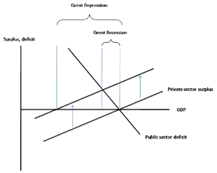
The private sector surplus represents the net saving of the private sector (households and businesses) from income after spending, while the public sector deficit is the government’s deficit. Krugman’s point in the graph is that the private sector has recently moved to deleverage substantially instead of spend and thereby raise its net saving, which has reduced GDP, though not as much as without the automatic stabilizers of fiscal policy (in his opinion, thankfully, since this was not present in the Great Depression . . . which would have had a much flatter public sector deficit curve). Much of the background for this graph was again discussed by Rob and Bill, so I’ll be brief here (those wanting more background should read Rob’s and/or Bill’s posts).
The graph isn’t finished, since, as Rob pointed out, we must add the international sector. To do this, and also to understand the graph itself (again, briefly here), consider the following standard macroeconomic accounting identity from any macroeconomics textbook:
(1) Private Saving – Investment = (Government Spending – Taxation) + (Exports – Imports)
Most neoclassical economists put private saving on the right-hand side of the equation and then multiply by -1, leaving investment equal to private saving, the government surplus, and foreign saving as a result of the trade deficit. This is shown in equation 2:
(2) Investment = Private Saving + (Taxation – Government Spending) + (Imports – Exports)
The right-hand side of equation 2 is usually referred to as “national saving” by neoclassical economists, and more “national saving” is thereby thought necessary to raise more business investment that in order to raise the economy’s long run capacity to produce goods and services. This interpretation is nearly ubiquitous in the profession.
However, this interpretation is inapplicable except for a fixed exchange rate monetary system operating under a gold-standard or currency-board type of regime in which there is in fact a “fixed” quantity of savings that exists or can be created. But in our flexible-exchange rate monetary system, saving does not finance spending; indeed, banks create loans without any prior deposits or reserves being necessary, as I have explained in previous posts to this blog.
Those of us employing the framework of J. M. Keynes, Hyman Minsky, Wynne Godley, and others mentioned by Rob, instead use the above equation to understand the financial status of the various sectors of the economy. That is, instead of saving to finance capital investment (which is not actually what happens), we have “private sector net saving,” which is the addition/subtraction to net financial wealth for the private sector in a given period. If the private sector is net borrowing, then its balance will be negative; if it is net saving, then its balance will be positive.
Most importantly, the economy’s financial flows are a closed system, so one sector’s deficit is another’s surplus, and vice versa. There is no way around it, just as it is impossible for every country in the world to have a trade surplus—at least one country must have a trade deficit for the others to have surpluses. Thus, “national saving” as defined in the textbooks (private saving + government surplus + foreign saving) is a misleading concept in our monetary system, since if the government is “saving” some other sector (or combination of them) must not be, by definition.
For this reason, instead of equation 2, we write equation 1 as the following:
(3) Private Sector Surplus or Net Saving = Government Deficit + Current Account Balance
The trade balance (exports – imports) is not the precise term to use when considering all financial flows, the current account balance is. For the US, the two very close in magnitude. We’ll call equation 3 the Sector Financial Balances (SFB) equation. Again, this is an accounting identity, not theory. Disagreeing with it is akin to believing the earth is flat. For examples of this framework directly in use on this blog, see here and here.
We can look historically at how these sector financial balances have moved over time. Figure 2 shows how closely the private sector surplus and the government sector deficit have moved historically, which isn’t surprising given they are nearly the opposing sides of an accounting identity. The difference between them, more visible starting in the 1980s, is the current account balance.
Figure 2: Historical Behavior of Private Sector Surplus and Government Sector Deficit as a percent of GDP
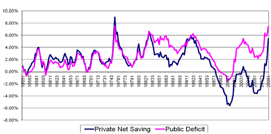
Figure 3 shows all three sector financial balances:
Figure 3: The Sector Financial Balances as a percent of GDP
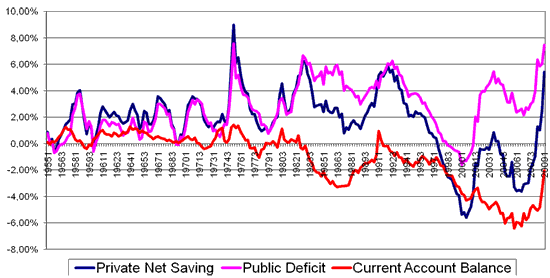
What we notice from these graphs is that the current rise in the government’s deficit is creating net saving for the private sector. It’s of no surprise to those of us that have been using this framework for years to hear that private saving is rising over the past several months, because we already know that’s usually what an increase in the government deficit does. Of course, the current account balance has also improved, which has also raised the private sector balance.
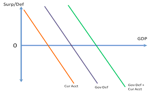
Turning to a graph to represent equation 3, Krugman’s graph has the left-hand side (the upward sloping private surplus, since higher income means higher saving, ceteris paribus) of the equation and part of the right-hand side (the downward sloping current account balance). The easiest way to incorporate the current account balance is to add it also to the government deficit, since like the government deficit the current account also tends to be countercyclical (that is, as incomes rise, we spend more on imports and the trade balance worsens).
I have merged the two below in Figure 4, which shows a countercyclical government deficit (due to automatic stablizers) and a countercyclical current account balance that together combine to make the “Gov Def + Cur Acct” line (the green line, which is the other two lines added together). The horizontal axis shows “aggregate income,” intended here to be the equivalent to the horizontal axis of the textbook Keynesian cross model (that is, GDP, but not necessarily in the sense of capacity to produce goods and services).
Figure 4: The Gov Def + Cur Acct Line, or Right-Hand Side of Equation 3
So, for the entire SFB model in Figure 5, we have the “Gov Def + Cur Acct” line (someone needs to think of a better name for it than this, for sure), and the PFSB line (Rob’s suggested title) to denote the private sector financial balance, which is upward sloping since higher incomes tend to raise total saving, ceteris paribus.
Figure 5: The SFB Model of Aggregate Demand
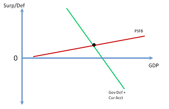
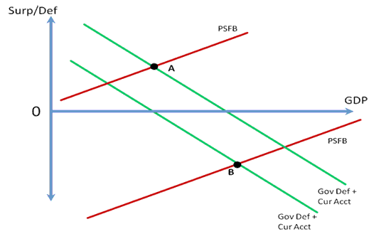
Figure 6 shows an application of the SFB model to the late 1990s boom in the US. First, the economy starts the mid-1990s at point A. The effects of previous and then new agreements between Congress and the President to reduce deficits shifts the Gov Def + Curr Acct line down, as do the financial crises in Asia that lead weakened those nations’ economies and currencies to thereby substantially lower the trade balance. However, instead of GDP falling as a result of these two leakages from aggregate demand, a number of factors including the massive rise in the stock market and “new economy” expectations leads to a historically large increase in the private sector’s willingness to leverage (which continued in the 2000s during the real estate boom after a short recession in 2001-2). This willingness to leverage shifted the PSFB line down markedly, raising real GDP growth and lowering unemployment. The economy ends the decade at a point like B, with a government budget surplus and current account deficit combining to equal a negative private sector balance. As shown in Figures 2 and 3 above, for the first time since 1959, the private sector’s financial balance turned negative in 1998, which not coincidentally was the year the federal government ran a budget surplus for the first time since 1969. As the trade deficit fell and the government’s deficit grew, the private sector’s financial balance grew increasingly negative.
Figure 6: The Economic Expansion of the 1990s
Returning to the current environment, Figures 2 and 3 show a substantial rise in the private sector’s balance as households and businesses has been determined to deleverage after both the 1990s and the real-estate bubble-induced leveraging of the 2000s. The outcome of this was shown in Krugman’s graph above (Figure 1), as the PFSB line shifted up (“private sector surplus” in Krugman’s graph) and GDP therefore fell. Only the automatic stabilizers (depicted as the downward sloping “public sector deficit” line) prevented a larger decline in GDP. Contributors to this blog (see here, here, and here) have long proposed a fiscal response that directly and quickly raises the private sector financial balance, such as a payroll tax holiday (which restores around $20 billion/week in household and business incomes immediately), immediate block grants to states (which are cutting essential services and raising taxes to balance budgets, as Stephanie Kelton explained), and a jobs program.
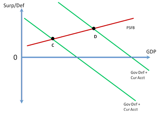
Figure 7 depicts this in the SFB model (Bill Mitchell produced a similar graph and discussion of the model in his post . . . highly recommended as well, with a bit more graphical detail than mine). The economy is currently at a point like C after a steep rise in the PFSB line that significantly reduced GDP while automatic stabilizers and an improvement in the current account balance that raised private net saving (as shown in Figures 2 and 3) limited the decline. A well-designed and sufficiently large fiscal stimulus would shift the Gov Def + Cur Acct line up and move the economy to a point like D, with higher real GDP and a higher private sector financial balance.
Figure 7: The Appropriate Fiscal Policy in the Current Environment
The SFB model shows the folly of concerns that households will simply “save” any tax cuts they receive; because the private sector desires to net save right now, if a given stimulus is not enough to quench the need to deleverage and raise GDP, then the answer is in fact more stimulus.
Of course, the recession could also be ended if the PSFB line shifted down to raise real GDP, but that implies an increase in private sector leverage, which is the opposite of what the private sector is currently attempting. This explains why using monetary policy—interest rate cuts to encourage borrowing—probably won’t work aside from reducing debt service burdens (while it also reduces income for savers, which again decreases the private sector’s financial balance by reducing government interest payments . . . a slight shift down of the Gov Def + Cur Acct line). Some other ideas popular in economics blogs related to negative nominal interest rates, such as the currency tax—which penalizes those holding transaction balances, and possibly other liquid balances, in an attempt to encourage spending—or the excess reserve tax—which attempts to move short-term, liquid investments into deposits or currency that will then be spent (or so those in support assume)—similarly attempt to raise real GDP by shifting the PSFB line down, and would thus also “work” by reducing the private sector’s financial balance.
In closing, the SFB model of aggregate demand can illustrate rather easily and clearly macroeconomic events and the effects of policies. As Rob explained, it would be a very good replacement for the IS-LM model of aggregate demand. There are many, many other things that can be demonstrated with the model that I don’t have time to go into right now. For instance, the employer of last resort policy proposal is an attempt to make the Gov Def + Cur Acct line vertical at the full employment level of GDP; or, for another example, the SFB model shows that aggregate demand is set by the government’s deficit relative to net savings desires of the non-government sectors (as Warren Mosler says, the government’s deficit is the “M” in the quantity theory of money, while the net savings desires of private sector are the inverse of the “V” in the equation).
Disclaimer: This page contains affiliate links. If you choose to make a purchase after clicking a link, we may receive a commission at no additional cost to you. Thank you for your support!


Leave a Reply