14 DAY TRIAL //
 This is the second part of the editorial “Top Web Trends for 2010.” The first part was dedicated to industry news and some of the things we believe will happen in general. We left the more accurate details and predictions to more serious and qualified experts.
In this part, we will deal with some trends that have influenced a part of the design market toward the end of the year and are expected to make a big impact at the start of 2010. This part will deal only with design-related issues.
10 Top Web Design Trends for 2010
Simpler Login Forms
It has always been a hassle and annoying task filling-in web forms. But since I've been testing scripts and online services for quite a while, I can sincerely say that this process has been made simpler by the year. From those awful days of the first phpBB forum releases that came with an annoyingly long login form to the recent TweetSwitch online service that I registered for a couple of days ago, the login system has evolved a lot.
Webmasters and designers are figuring out all the details, putting all the pieces together and starting to leave the users alone. No more 25-row long registration forms, no more big login screens in a corner of a website. These days, modals, drop-down forms and 3-4 rows of registration details are considered enough for a user to access their account.
The trend doesn't stop here though, login actions are getting more and more centralized, and services like OpenID are receiving more and more implementations. But to be fair, OpenID is last year's real winner in popularity. For 2010, we anticipate that the API (in general) will be the one chosen by developers. The hype surrounding the OpenID project seemed to go down toward the end of the year, and many well-known websites around the web provided alternatives on login actions by using Twitter credentials, Facebook ids or with Google Accounts.
Typography and Fonts Enter New Era
Designers following market trends will not be surprised by this pick, since it was on the list of many experts in the previous year as well. The reason why we chose it is the near release date of HTML5 that is bound to break some web font usage barriers that limited many designers in previous years.
HTML5 comes with a new method to upload fonts to the web-server and have the user download them if they are not installed on their computer when they access the site. Using this technique, any previous barriers in employing fonts for styling techniques will be stomped in to the ground by web designers.
There is the possibility in non-standard fonts over-usage, but I'm willing to pass over it just because there are currently way too many good designers out there not to know the difference when to stop and how to properly use fonts.
If HTML5 is released this year, websites will start to look more and more like magazines. Already predicted by many industry experts as a hot trend for 2010, the magazine layout will then be complete with the font repository being let loose on the web.
In case W3C fails again in releasing a usable and stable version of HTML5, typography will still have a big say in web design showcase, the Internet being filled every month with new PHP or JavaScript-powered scripts that provide different alternatives in embedding non-standard fonts in web pages.
Here are some of the most powerful: TTFGen, TypeSelect, sIFR, wp-Typography, AnyFont, Typogrify, Text to image with selected font, Overlay Text, TextToImage and much more.
More Whitespace
For those who have never heard this term, whitespace is the dead space that resides between web elements (between fonts, letters, boxes, margin and text areas, etc.). While a simple look over some home page designs in online showcases will display that designers are starting to use it more and more efficiently, not many web pages being optimized in this section.
The cultural status that some web design tutorial and e-learning websites have reached in recent years has contributed to the education of many up and coming web designers out there. Smashing Magazine, FreelanceSwitch, Tuts+, CSSMania, DesignerDepot and many more have established themselves as promoters of good design. Some recent articles on these websites will totally agree with what we stated until know and probably the rest of this article. Whitespace, Typography, Modals, Sketches and HD photography are raising the quality of design. A quick look through those articles could be just enough to educate any person in how and why it is better to use whitespace to your advantage.
Presentation Boxes
More and more, the upper (left) section of a website is used for adding and presenting a small display of what you'll find inside. Designers use it to present their main skills, vendors use it to tell you what they primarily sell, developers tell you what kind of apps they can develop, etc.
Either done graphically with images and photos, or done the simple way with some nice typography, this trend won't go away the next year because it's that useful. Many times, a motto can do more than a thousand words. A small picture can speak volumes. Why complicate your existence with expensive copy-written text, when a simple line could do the trick? And it's even cheaper in copyright costs as well.
If you still are conspicuous about this, just take a look at Apple's website. The first thing you see when you access it is one of its latest products. Big image, big text and a menu. Only by scrolling down, the rest of the content is revealed and more detailed information is shown.
Modals
Many have probably got used to them as image viewers. But since more and more developers are adapting their image viewers to use AJAX and load any kind of web content, these small pop-ups have entered a new era.
Just take a look at some of the modal scripts we have indexed here on Softpedia, and their descriptions and screenshots should provide a general idea of what they can do these days.
One Page Layouts
AJAX has made such a big impact in recent years that the face of web applications is about to be changed forever. Realizing that page refreshes are not that user-friendly because they tend to visually disconnect the user from the viewed page, AJAX has been adopted as a solution for keeping website content on the same page (when visually appropriate) without blanking out the browser window for them.
Used in combination with pre-loaders and other type of animations, it brings regular coded websites even closer to the futuristic and above-the-average designs and interactivity of Flash websites.
Look for more and more one-page layouts to appear on the web, powered by Flash, AJAX, or other jQuery or MooTools plugins. Just take a look at some useful AJAX scripts in building such web templates.
Also, here's a link where, for the month of January 2010, everyone can download a free AJAX-powered one page website template (courtesy of Envato). Just as an example. Or even more.
Sketches
The availability of image editing and automatic coding software has flooded the web design market more than “real” designers are willing to accept it. This trend will probably draw a big and deep line in the sand to separate all those wannabes from the real artists.
As we all know, drawing is not for everybody, and only people with proper training or real talent are able to pull it off. Because of the recent flooding of the design market, design quality was risen so high that a new trend started showing up till the end of the year.
As high competition started to present itself on the design market, a lot of the real designers had to resort to something that not many like to do these days: hand drawings. Superior in quality and adding a certain “je ne sais quoi” to a web page, sketches are definitely in for 2010.
Big Everything
As the overall quality of stock illustrations and photography increases, there will be no limitation in using high definition graphics everywhere on a page. This revolution of HD and quality graphics was not triggered by the explosion of design software and browser evolution, but by an increase in Internet connection bandwidth, which saw designers not limit themselves anymore.
As the magazine layout trend we have previously discussed continues to grow and attract new followers, get ready to see bigger and bigger graphics on web pages.
The trend does not affect only graphics, but elements as well. Expect bigger footers, headers, introduction boxes and text areas. The ones to lose in this expansion of certain elements will be dead elements. We see site search sections being relegated to their own page, RSS and other subscription icons getting smaller or pushed to the corners of the page, presentation and other text areas getting smaller or more precise in their expression, and various other content being presented using modals as much as possible.
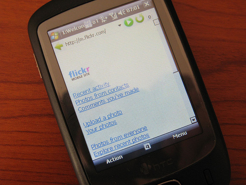
Mobile Versions for Websites Become Compulsory
A recent surge in mobile phones development and some reports from mobile browser manufacturers should give a general sense of the mobile web stage of evolution. Phones are more and more smart, getting closer and closer to an average PC's performance. People can now do a lot of things that they were doing previously only on desktops. And since the web has engraved itself in our day-to-day life, users will often access it from their phones.
Many websites owned by big companies were available in mobile form since years ago. But especially with the release of the iPhone, developers have found a big chunk of projects in translating some regular and not that well-known websites into mobile formats. Not difficult as it sometimes looks, converting or writing a website in a mobile format will help a company get ahead of its competitors ignoring this sector.
Expect to see more and more websites being available from your phone, and if you are a developer, we recommend learning to code in liquid HTML format.
More High Definition Photography on Websites
This is my favorite emerging trend. There is a certain aura around a well shot photography. Besides its content (which makes up only 50% of the photo), the way its done and presented to the user will surely enhance its usability on various projects.
High-definition photos have been around for a long time, but in the early years of the past decade, it was used mainly in print, being rarely included on websites. Sure, they were large in size, and image encoding wasn't as efficient as it is today. But the bandwidth connection boom and the extended PNG support in browsers have paved the way for its entrance in web design as well.
There are various usages of these photos. While at first used only in image galleries to showcase projects, products and personal photos, it has expanded to the rest of the basic elements where JPEGs and GIFs ruled until now. Shoving aside those lossy formats, PNGs have eased and accelerated the entrance of HD photos on the web.
More and more photos will start popping up in headers, product pictures, presentation boxes, and (my favorite) backgrounds. Just check out the impact Twitter had on this trend. Recently, design work indexes have started adding a category called Twitter backgrounds to their available jobs categories, where designers can use techniques previously prohibited and outlawed by small bandwidth, page loading speeds and lossy compressions to design beautiful background images for Twitter.
Here are a few scripts found on our index that would be useless without high resolution and definition imagery: Supersized, Galleria, Imago and many more.
The last part of the Top Web Trends editorial for 2010 will follow shortly to discuss top coding and programming trends.