The 4 Scariest Economic Graphs I've Seen This Year
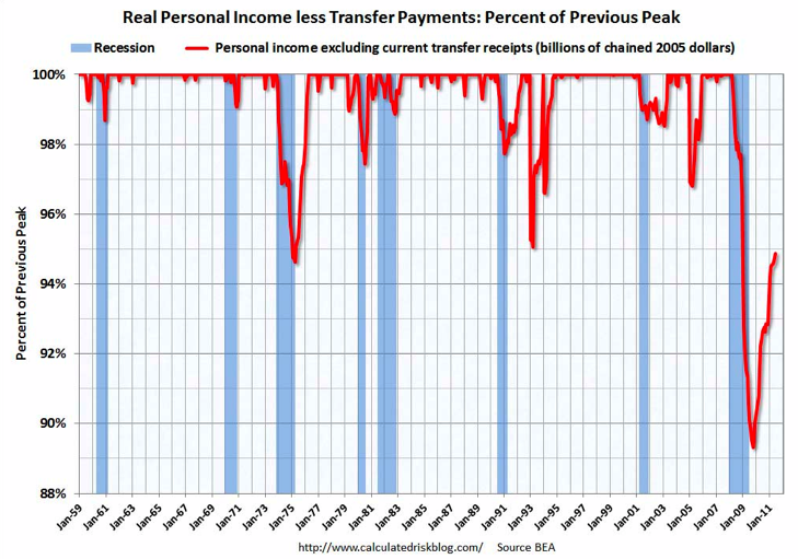
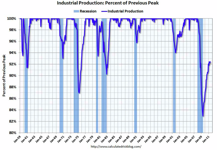
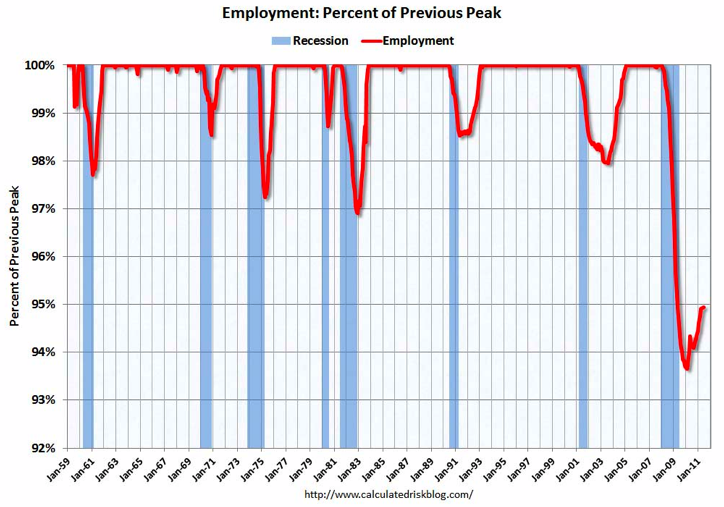
This is a remarkable sequence of pictures from Calculated Risk showing that no major economic indicator has returned to its pre-crisis level. In other words, after two years of recovery, not a single key broad measure of the economy has actually recovered.
The ingenious thing about these graphs, which I've never before seen, is that they compare key recession indicators as a share of their pre-recession peaks. The outcome reveals each recession in the last 50 years as a kind of hanging icicle. Ours is by far the longest, and we don't yet know when we'll trace our way back to the 2007. Here's why I don't expect the path up to get much smoother in the near future.

Derek Thompson is a staff writer at The Atlantic and the author of the Work in Progress newsletter.