#30: The Steampunk Harem by Aly Fell
The Steampunk Harem, by Aly Fell, copyright 2009.
This analysis copyright 2010 by Scott M. McDaniel.
The Image
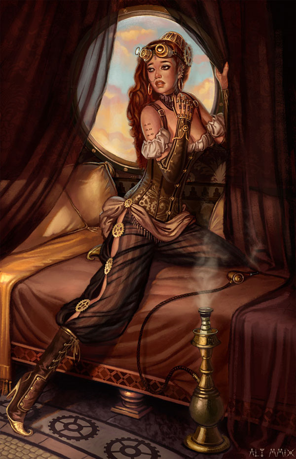
The website ConceptArt.org has, among other things, an activity called “Character of the Week.” In November of 2009, one of the topics was “Steampunk Harem.” Participants have one week to produce a painting from scratch that satisfies the brief, which for this one was:
They are pampered and preened for the Sultan and Sultana. Doused with pungent oils, washed with lavender and cinnamon scented perfumes, their skins perfect and their complexions refined and painted to reflect the whim of their master and mistress.
They are treated with respect and adoring attention, but they are prisoners; birds in a gilded-cage. They are the concubines of the king and queen, the harem slaves of oriental fantasy. But the world these particular chattels inhabit is a Steampunk world.
This week design a Steampunk harem boy or girl. Either gender, it’s up to you; and environment is also at your own discretion. This harem is fantasy, and we suggest looking at odalisques and Victorian Orientalist painting as inspiration, but keep in mind their costume and world they inhabit is Steampunk.
I’m familiar with Aly Fell (aka Poshspice) from his long-time participation in the Character of the Week activities, and he is one of the current moderators. This is the painting he did for the activity, and in addition to capturing the brief I think it’s a fine example of the classic pinup. For this analysis, I’ll look at several things, including what makes something a pinup, composition and rhythm, and the role of details in creating a finished piece.
Composition and Rhythm
OK, here’s a smaller version of the picture with a lot of stuff packed into it:

Stage 1: Blank Grey. We’re about to look at how Fell uses the silhouette and frames the figure with it. So, next up is…
Stage 2: The dark frame. The curtains are dark and they create a frame in which Fell will put his figure. Even at this stage look at how our eyes are drawn to the contrast and basic foreground shape created by the frame.
Stage 3: The light frame. When is the last time you saw a waning gibous moon in an illustration? Circles are a classic framing device to draw our attention to something. Here it’s not a moon, of course, but rather a bright porthole window framing a beautiful woman. A bright circle is a simple, pleasing shape. It also gives Fell a way to create some high contrast and bring our attention to the figure inside.
Stage 4: The silhouette. So the figure now has our attention what with all that framing. From just the silhouette we can easily tell that it’s a woman and see that she is sitting/leaning. The arms are little more ambiguous. One of them doesn’t appear in the silhouette at all, and the other is partially obscured by the curtain. Overall, though, we’ve clearly identified the woman her posture, and even her basic attitude.
Stage 5: Alternating Value. Like Howard Pyle, Fell sets up a rhythm of light and dark that alternates between each. At a large scale you don’t see something dark next to something even darker.
Stage 6: Alternating Values Part 2. This is to let you see that alternating pattern in the actual picture.
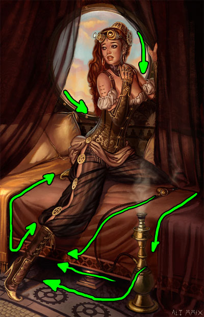
Something else to notice is the simplicity of the overall layout and composition. It recalls J.C. Leyendecker’s Couple Descending a Staircase. The basic layout is a sweeping curve moving downward and to the left. Aside from the woman’s pose, the shapes of the curtains and bed also move us that way. Before our eye leaves the painting, however, we end up going back up the woman’s leg. Her shoe comes a little close to edge of the painting for my taste, but doesn’t touch it.
Let’s take a look at the values too. Here is the picture with saturation dropped to zero.
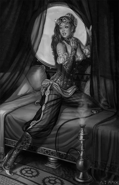
Even the framing window is not actually that bright. The brightest parts are the highlights on her goggles and other machinery. Aside from adding depth, putting the highlights there and, for example, on the gear mid-thigh brings our attention to the steampunk nature of the setting. The brightest spot I found had a brightness of 94% (on her goggles). The sky behind her, though, is around 65-70%.
Now that we’ve looked at values, try looking back up at the main version and looking at where Fell put his most saturated colors.
The Pinup Formula
Here’s my developing theory of what makes a good pinup. (At some point I’ll do one of these for Alberto Vargas and revise it further.)
Simple, graphical composition. The curtains above form a basic arc in this picture, and then the window puts a nice clean circle around the woman’s head. Pinups aren’t the place to get creative with compositions – keep it simple.
Clear silhouette. We’ve got to be able to easily read the picture and separate figure (the person) from background. Silhouette is critical to that, and we should be able to tell the person’s shape, posture, and attitude just from the silhouette.
Revealing Pose. But not too revealing. We should clearly see the shape of legs, hips, chest, or back. We’re not talking about what I’ve seen figure photographers refer to as an “open leg pose” – we’re not giving away the store. The level of clothing varies, but it will always show off the figure.
Self-conscious Pose. In this picture the woman isn’t looking at us, but in many pinup paintings she is. Regardless, the person is aware of being watched on some level and is giving us an exaggerated posture that shows off the physique. Sometimes the model breaks the fourth wall and flirts with us directly. Other times, like in The Steampunk Harem, we see a melodramatic pose of the damsel in distress.
Certain Type of Physique. For pinups of women, we usually see a person who is voluptuous and curvy. She’s at least moderately endowed and in her 20’s or 30’s. Makeup will be obviously present (red lips, mascara). (Whether or not that’s what the artist finds sexy is irrelevant in a way.) Hair will usually be styled and between shoulder and back length. That’s certainly what we’ve got in this painting. See the Mucha analysis for another example. I’m sure there is a similar formula for men.
The Details
I mentioned how pinups should be simple. Sometimes there is only the barest suggestion of a background, like Vargas’ cover to the Cars album Candy-O. Steampunk, on the other hand, calls for gears and machinery and intricate patterns. Fell had to keep things simple but still provide enough of the fine detail that we’d see the steampunk in the situation.
His composition is simple and pure pinup. To keep from overwhelming the picture, he chose to put just about all of the steampunk details on the figure with the exception of the gears on the floor tiles. The style of the porthole and the fact that we’re in an airship also feeds the steampunk atmosphere. Other details come from the orientalist painting tradition, like the trim along the bottom of the bed, the translucent curtains, and the hookah.
Here is an example of the detail we can see in the head and shoulders. Compare the level of detail to the pillows and bed linen below.
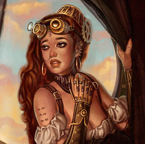
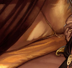
(Am I the only one that finds the idea of a pierced upper arm just a bit unsettling?)
When it comes right down to it, even the hair net, gears, collar, and hand-thing look more complicated than they are. The simplicity in them fits the pinup idea. Like all Character of the Week drawings, Fell only had a week do this, so only a certain level of detail is possible. Even so, the glove appears intricate though it’s composed of simple cylinders and circles. The key is to pick the right details and let the viewer mentally fill in others.
Here are two more details that I’ll toss out because I think they’re cool. The corset and hips are neat:
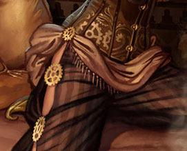
Finally, don’t miss Fell’s signature in the lower right corner:
![]()
The Elements
To wrap up we’ll go through Lee Moyer’s Elements of a Successful Illustration.
Focus: As with all pinups, there is only one focus and it’s on the figure.
Composition and Design: Fell keeps the composition clean and simple, framing the figure with both light and dark shapes.
Palette: Warm reds and browns take up most of the picture. The sky through the window gives a nice cool accent from the complementary blue.
Value: Not as bright as I’d first thought. It’s a dark to mid-tone painting for the most part, which bright highlights reserved for only a few key details.
Mass: Fell gets a nice sense of volume through values, lighting, and shadow placement.
Texture: I like the textures we see on the floor and the pillows particularly. They’re subtle but help keep things from feeling too slick.
Symbolism: Consider the shape and placement of the hookah? Conscious? I don’t know, but pinups generally aren’t known for subtlety. Or maybe my mind’s just in the gutter.
Micro/Macro: Fell does a good job of giving us just the right details. A moorish geometric pattern on the bedsheets may make logical sense but would just confuse our eyes.
Ornament: It’s steampunk.
Narrative: Pinups tend to be light on narrative, but that doesn’t mean story is absent. We see she is on an airship, and her pose and expression indicate Hollywood-style distress.
Juxtaposition: The color and placement of the window contrast with the figure.
Stylization: How often do you see a mix of pinup, orientalist painting, and steampunk?
Character: Pinups aren’t about plumbing the depths of the soul. They paint with broad strokes, so we get a broad impression of the woman’s character based on posture and costume.
Tension: Well, there’s that distress I mentioned. I somehow doubt she’s about plunge to her doom. A dark and mysterious sultan from high pulp tradition is likely in her future, though.
Line: The clearest edges are around the woman and window. The further we get from the focus the less defined the edges need to be.
Research/Reference: Since he posted the topic in the first place, I know that Fell looked for and pointed the participants to resources involving both steampunk and orientalist painting.
Vignette: We see background but the silhouette is clear.
Perspective: Perspective is not a major part of the painting. Most of the painting is midground, with only clouds and sky in the distance.
That’s it for this (belated) analysis. I’m going to take this weekend off to deal with some other art related things that have come up and will be back the following weekend.
[…] This post was mentioned on Twitter by Commodore Creazil. Commodore Creazil said: @SpecMinds Let us attempt this communication again. – http://is.gd/c4onG – http://is.gd/c4opC – http://is.gd/c4oro […]