
Designing an informational/content-centered website (such as a portfolio or a blog) is much easier than designing a website where we have to deal with registered users. The target of websites that enable user accounts (such as Amazon.com or Gmail, for example) is to not only highlight their featured items and services, but to also convert visitors to signed-up users. Sites with user registration want to grab every visitor who goes their website.
They list their website in every popular search engine, use advertising in other websites, work with bloggers to help promote their products, enlist the help of usability experts and go through great lengths to get noticed. All the effort is for a single desired action, which is user registration. 
Converting Visitors to Users
To convert a visitor to a registered user is not an easy process.
The website’s interface must be well thought out and carefully planned to encourage users to register. Many websites employ carefully created usability tests—such as split tests, for example—to determine the optimal layout that gets the most user registrations. They study their website analytics results vigilantly to find pages that convert visitors to users successfully, and web pages that don’t.
Here are some tips for enticing users to register to your site. The registration button should be positioned near the main features/header area (usually at the top part of web layouts). The visitor shouldn’t have to search for the registration button when they first visit the site.
The visitor shouldn’t have to scroll down to see the register button. Create an enticing and memorable call to action that asks visitors to register and try your services. Display the top main features of the product/website/service in the homepage.
When a visitor goes to a new and unfamiliar website, he/she wants a clear vision of what the website is about. It’s very important to create effective, high-impact, and powerful website headers to compliment your registration buttons. Mention the benefits of registering on your website. What special features will the visitor get to justify the few seconds that they invest in registering and becoming a user?
Highlight these benefits near your registration button so that when they read it, they have quick access to your registration form.
Looking at Some Registration Buttons
Let’s see some real-world examples of good registration buttons.
Liveresto
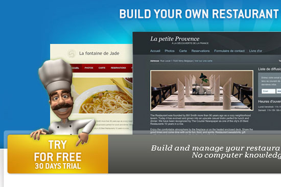 Liveresto is a website for restaurants.
They display the three best websites that they’ve designed at the top part of the layout. Under it, there is a chef pointing to the Sign Up button, drawing attention to the button and making sure that first-time visitors won’t miss it.
EECI
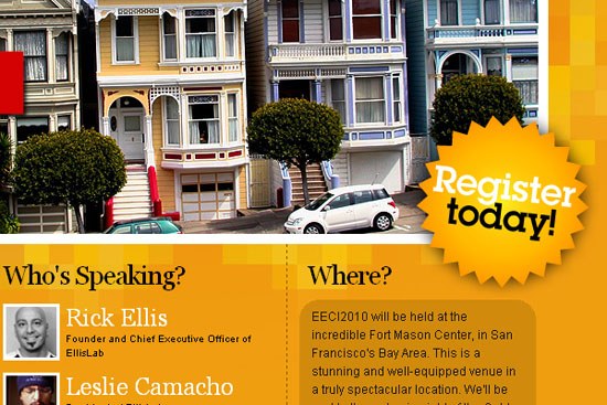 EECI is about conferences around a city.
When you enter the website, your eye will go straight to the bright red “San Francisco” ribbon on the left. The eye then naturally flows to the right, towards a star badge registration button that says, “Register today!” The badge registration button is bright and huge. The color of the star badge beautifully blends with the site design, yet is still very noticeable.
InstantLoop
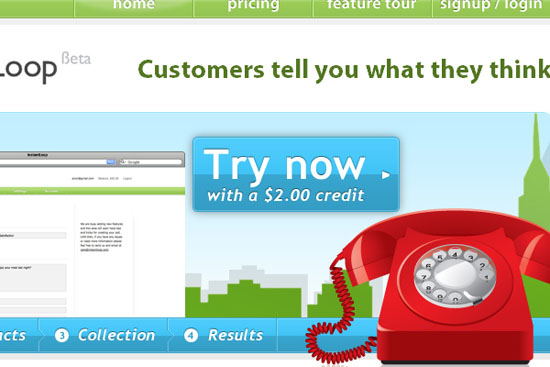 InstantLoop shows their registration button with the call to action text, “Try Now”. The button is huge and located prominently in the header area.
Vegas Uncork’d
 Vegas Uncork’d has a huge Flash banner that starts playing a catchy site intro that becomes an interactive JavaScript-based slideshow with information about the events to let users know what the site is all about. There is a button at the top of the web page that says “Sign up for updates” for easy access once the visitor is familiarized with the site and ready to become a user.
Buysellads
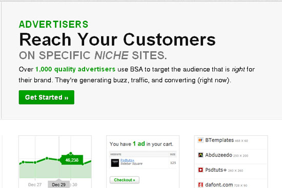 BuySellAds is a very popular site where many blogs can find advertisers to advertise on their website. Only the publishers have to register to set up their Publisher dashboard. On the left side of the web layout, you can see a section for Publishers that has a call-to-action button that says “Join Us”.
Fitbit
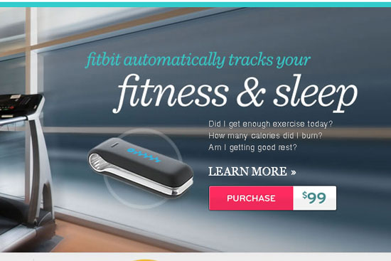 Fitbit is website for health-related products and their main objective is to sell their products. When you first visit the site, your attention will go straight to the text “fitness & sleep” to the right of the layout. The “Sign Up” registration button is below it and has a bright pink color that makes it hard to miss.
More Examples of Registration Buttons
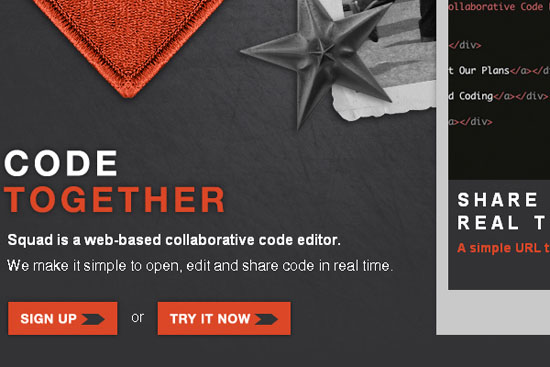
Squadedit
Playintraffik
Baramail
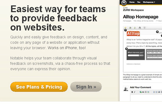
Notableapp
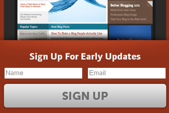
Betterblogger
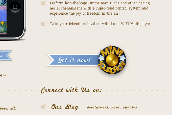
Mini Squadron
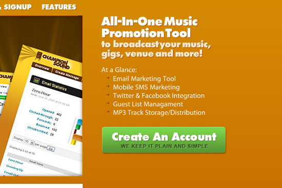
Championsound
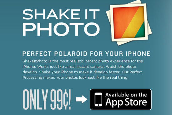
Shakeitphoto
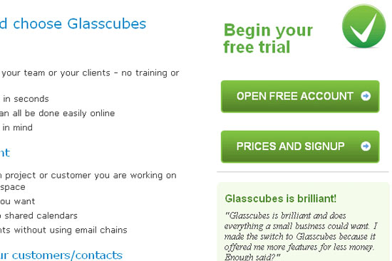
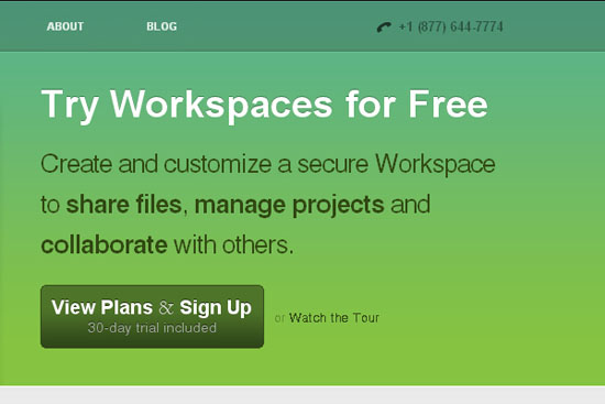
Glasscubes
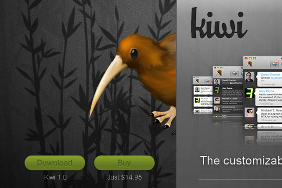
Kiwi App
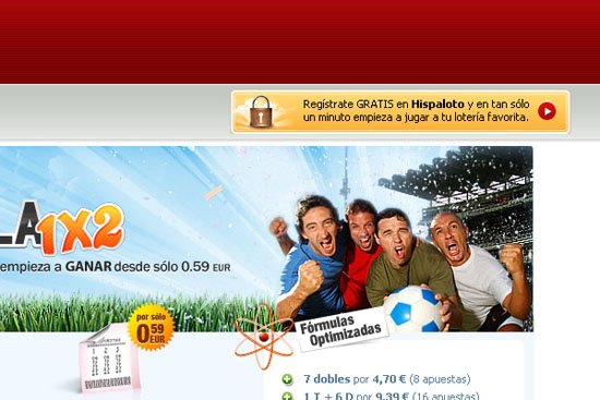
Hispaloto
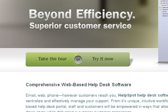
HelpSpot
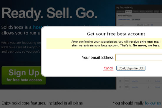
Solidshops
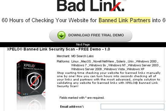
Xpelo
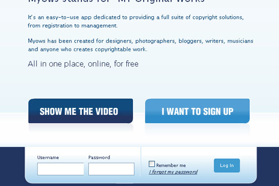
Myows
Myvoxtopia

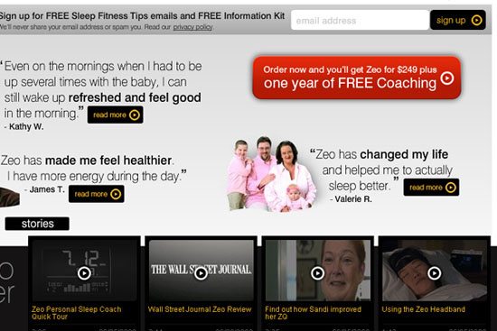
Myzeo
Onehub
Ooizit
Simplifythis
Sprouter

Storenvy

Briterevolution

Logodeck
Related Content
-
 President of WebFX. Bill has over 25 years of experience in the Internet marketing industry specializing in SEO, UX, information architecture, marketing automation and more. William’s background in scientific computing and education from Shippensburg and MIT provided the foundation for MarketingCloudFX and other key research and development projects at WebFX.
 -

WebFX is a full-service marketing agency with 1,100+ client reviews and a 4.9-star rating on Clutch! Find out how our expert team and revenue-accelerating tech can drive results for you! Learn more
Make estimating web design costs easy
Website design costs can be tricky to nail down. Get an instant estimate for a custom web design with our free website design cost calculator!
Try Our Free Web Design Cost Calculator
Share this article


Web Design Calculator
Use our free tool to get a free, instant quote in under 60 seconds.
View Web Design CalculatorMake estimating web design costs easy
Website design costs can be tricky to nail down. Get an instant estimate for a custom web design with our free website design cost calculator!
Try Our Free Web Design Cost Calculator


