Tools
Tools
Contents
1 Barycentric Visualization
1.1 Barry2D for CPUs and Multicores
1.2 CPUplayer Tool
1.3 Barry2D for Apdex
1.4 Barry3D for Network Utilization
2 Pretty Damn Quick (PDQ)
3 Significant Digits
3.1 Significant Figures Calculator
3.2 Significance Rounding Calculator
4 PerfViz Group
1 Barycentric Visualization
Here are some prototype examples of visualizaton tools directed at performance analysis exploration
rather than simple reporting. The detailed attributes are discussed below.
Additional ackground concerning the general approach can be found in the CMG 2007 conference paper
Seeing It All at Once with Barry (PDF).
| (1) Barry2D CPU | (2) CPUplayer Tool |
 |  |
| (3) Barry2D Apdex | (4) Barry3D Network |
 |  |
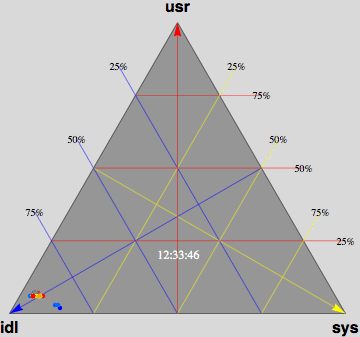
1.1 Barry2D for CPUs and Multicores
Barry2D in Fig. 1 above
displays CPU utilization for a 72-way multiprocessor
running a network-based workload on ORACLE 10g. The barry-3 axes are:
- USR: %user time (vertical upward increasing, red)
- SYS: %system time (left-right downward increasing, yellow)
- IDL: %idle (right-left downward increasing, blue)
At 12:36:46, the workload begins to ramp up starting at the lower left
corner of the triangle; maximum idleness. Most of the CPUs (shown as
colored dots) gradually make their way up the blue idle axis (decreasing
idleness) to cluster around the region bounded by the 25% idle line, the
25% sys line and the 50% usr line. However, 3 CPUs peel off at around
10% usr time and rapidly migrate (rightward) to the 80-90% sys location;
near the tip of the yellow arrow.
These CPUs are dedicated to handling
network traffic and other house-keeping. At 12:53:41, the workload
completes and all the CPU dots rapidly return to the tip of the blue arrow
as they become idle again. Some clean up continues as some of the CPUs are
seen to run back and forth along the base of the Barry3 triangle (zero usr
time) between idle and system time. The frame rate of 1 second corresponds
to 10 seconds of real time, as shown in the clock display. (Data supplied
with permission by Time Cook of Sun Microsystems.)
1.2 CPUplayer Tool
A limitation of the above
Mathematica prototypes
is that you need to use
Mathematica.
CPUplayer in Fig. 2 above
is a stand-alone version of Barry2D, written by
Stefan Parvu,
that provides animation for visually exploring performance issues based on multiprocessor utilization data.
Moreover, since it is open-source, all the code for contructing
CPUplayer is available on GitHub.
CPUplayer offers:
- Stand-alone video playback of historical multiprocessor utilization data
- Data format can be as simple as CSV
- Toggled display of date and time information
- Toggled display of multicore IDs
- Toggled display of USR, SYS and IDL axes
- Full color performance zones
CPUplayer has been used in a case study diplaying the performance advantages of enabling
processor sets in Solaris 10 for a Sybase OLTP workload running on a Sun Entreprise T5220
with up to 32 virtual processors.
(cf. Mathematica animation in Fig. 1 above
for Oracle OLTP workload on a Sun E10K server)
1.3 Barry2D for Apdex
The Apdex Alliance
is a group of companies collaborating to promote an
application performance metric called Apdex. Apdex is a numerical measure
of user satisfaction with the performance of enterprise applications, and
reflects the effectiveness of IT investments in contributing to business
objectives.
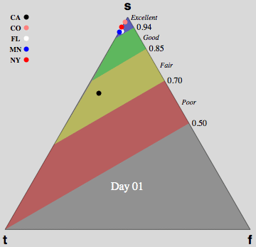
The visualization in Fig. 3 above shows both the Apdex index and its component
categories can be displayed for multiple geographical locations simultaneously.
The location of each dot is determined by its percentage of satisfied
(s), tolerating (t) and frustrated (f) counts.
In this case, the unnormalized categorical data is binned according to:
- S: Samples < 4 seconds
- T: 4 seconds < Samples < 16 seconds
- F: Samples > 16 seconds
The Apdex response time measurements were collected from 5 different
geographic locations (shown in the legend) over a period of 30 days. Data
supplied with permission by Peter Sevcik of the Apdex Alliance.
The gray background is superimposed to better display the colored dots.
This visualization concept was
presented (PDF)
at the 2007 Apdex Symposium.
1.4 Barry3D for Network Utilization
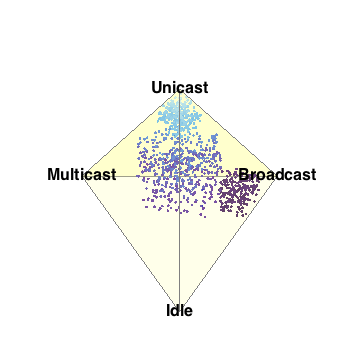
Fig. 4
above is a representation of the 3-simplex depecting 4
network performance metrics in three dimensions for 1,000 network segments
depicted as a cloud of points.
It is very clear, even without looking closely at the
visual area, that the points cluster into 3 sub-clouds along certain
viewing angles. This is the barycentric analog of the MacSpin example.
2 Pretty Damn Quick (PDQ)
Queueing-based performance analyzer.
3 Significant Digits
One way to maintain all input digits explicitly is to represent them as a string of characters. This can be accomplished
by either reading the number in from the keyboard or by passing it as a string-valued
parameter in quotes. Otherwise, an input number like 0.040300 (which has 5 sig digits)
would be represented as 0.0403 in numerical form (trainling zeros are
truncated) and that would lead to the incorrect conclusion that the number only had
3 sig digits on input.
For more background information
see Chap. 3 of Guerrilla Capacity Planning and
Significant Figures in R and Info Zeros.
3.1 Significant Figures Calculator
Compute the significant digits in a number.
3.2 Significance Rounding Calculator
The input number is correctly rounded to the required reporting significance using the new rounding rule that avoids parity bias.
See also
Significant Figures in R and Rounding.
4 PerfViz Group
Join the ongoing discussions at the PerfViz Google group.
Copyright © 2002-2011
Performance Dynamics.
All Rights Reserved.
File translated from
TEX
by
TTH,
version 3.38.
On 27 Mar 2014, 17:59.